A New Coat of Paint
The blog looks different. Here's what changed, what stayed, and why it took this long.

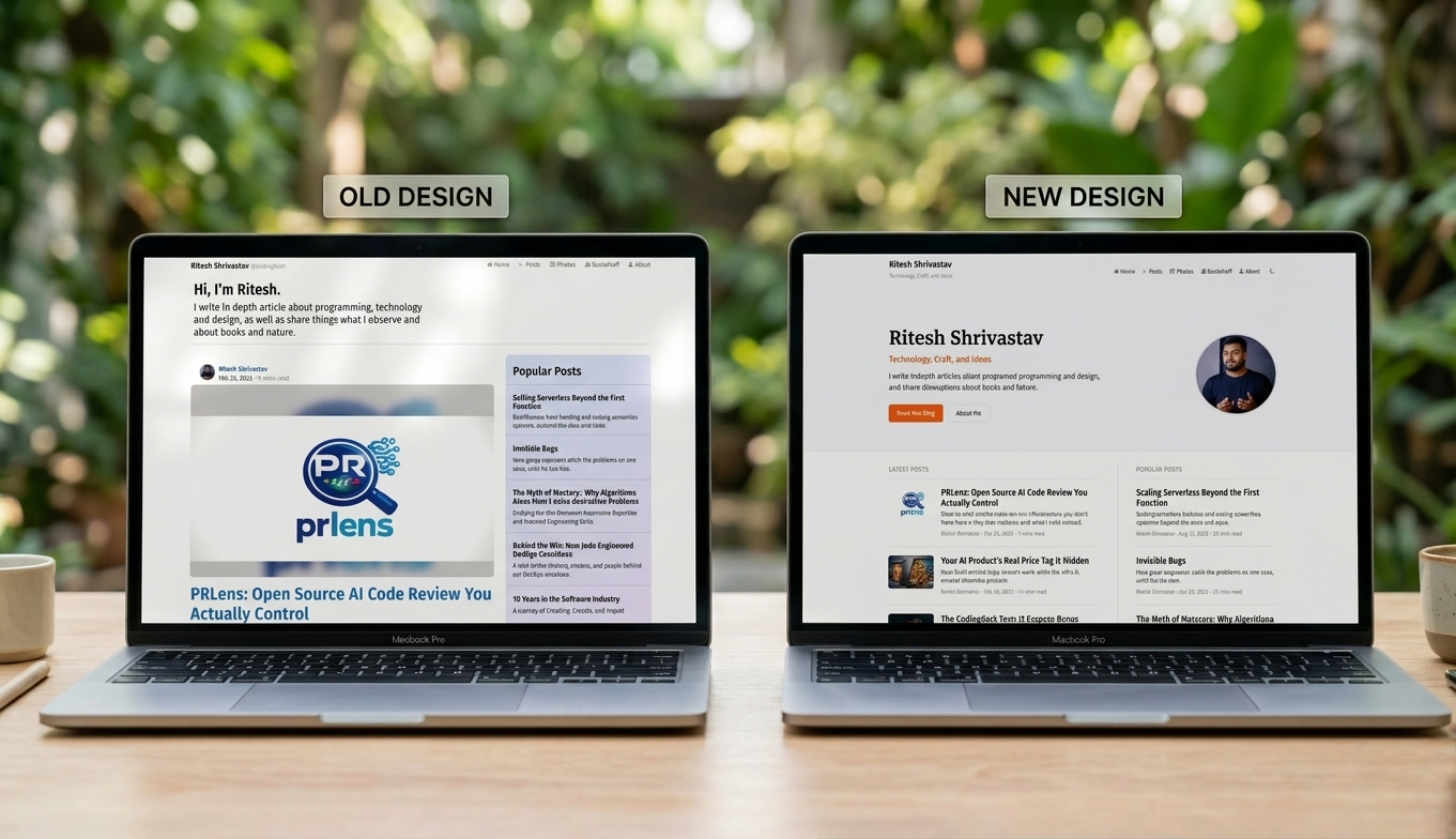
If you’ve been here before, something looks different. The site has been redesigned quietly, without fanfare, the way most things I care about get done.
I want to be clear about what this post is not: it’s not a deep dive into design theory, or a tutorial on how I built it. It’s just a note. The kind you’d leave on a door after rearranging the furniture; not because the furniture is the point, but because you’d notice if I didn’t mention it.
This blog started in 2014. It’s run on the same Jekyll setup, the same GitLab Pages deployment, and more or less the same visual bones for years. I’ve written about serverless systems, DevOps, books I’ve read, and the occasional thing that’s hard to categorize. The design has always been secondary to the writing. But secondary doesn’t mean unimportant. A design that gets in the way is a design that costs you a reader.
The old design worked. This one works better. That’s the entire case for doing it.
What actually changed
Here’s a plain summary. Not exhaustive — there were a lot of small decisions — but the things you’ll actually notice:
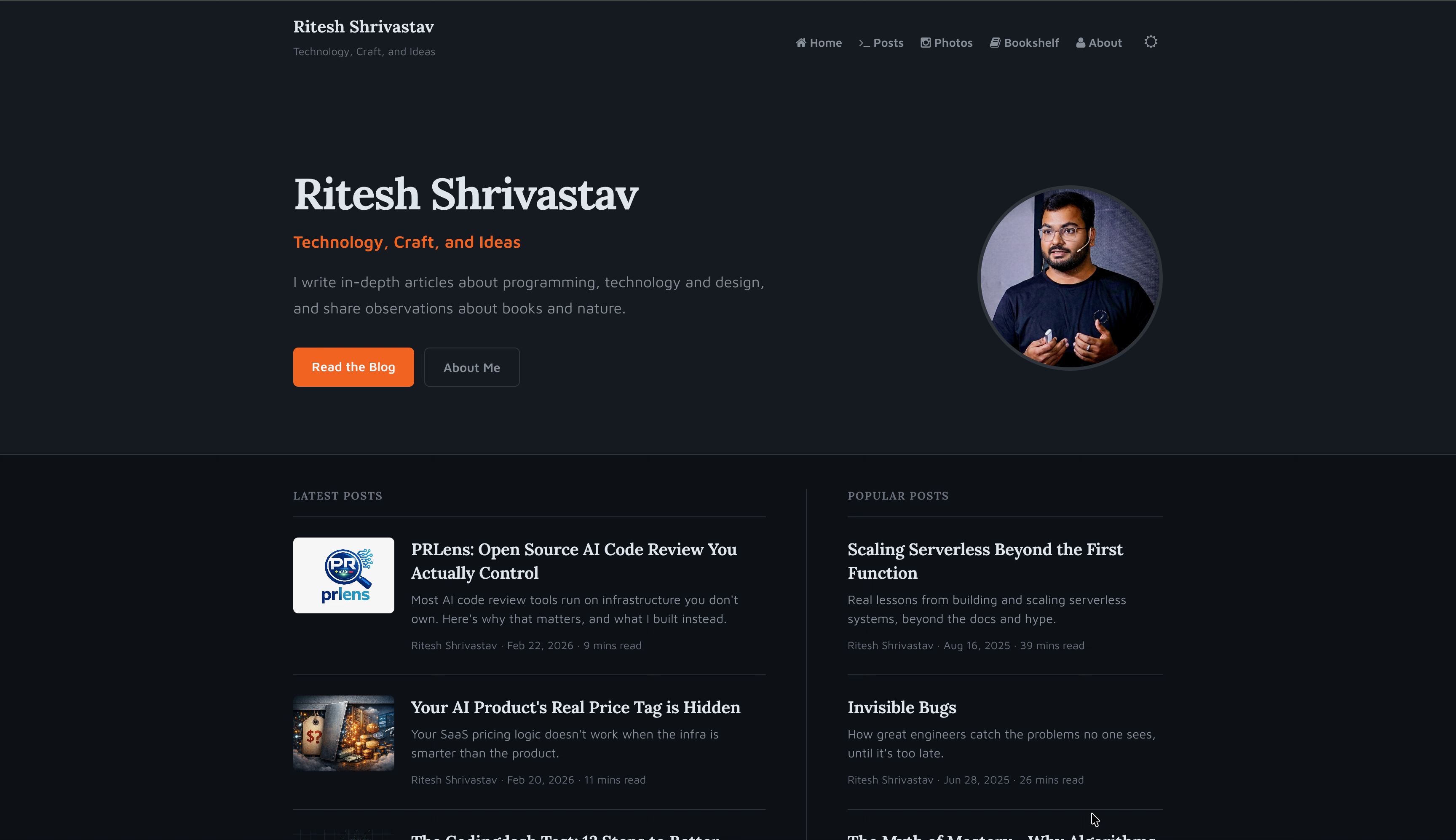
Homepage
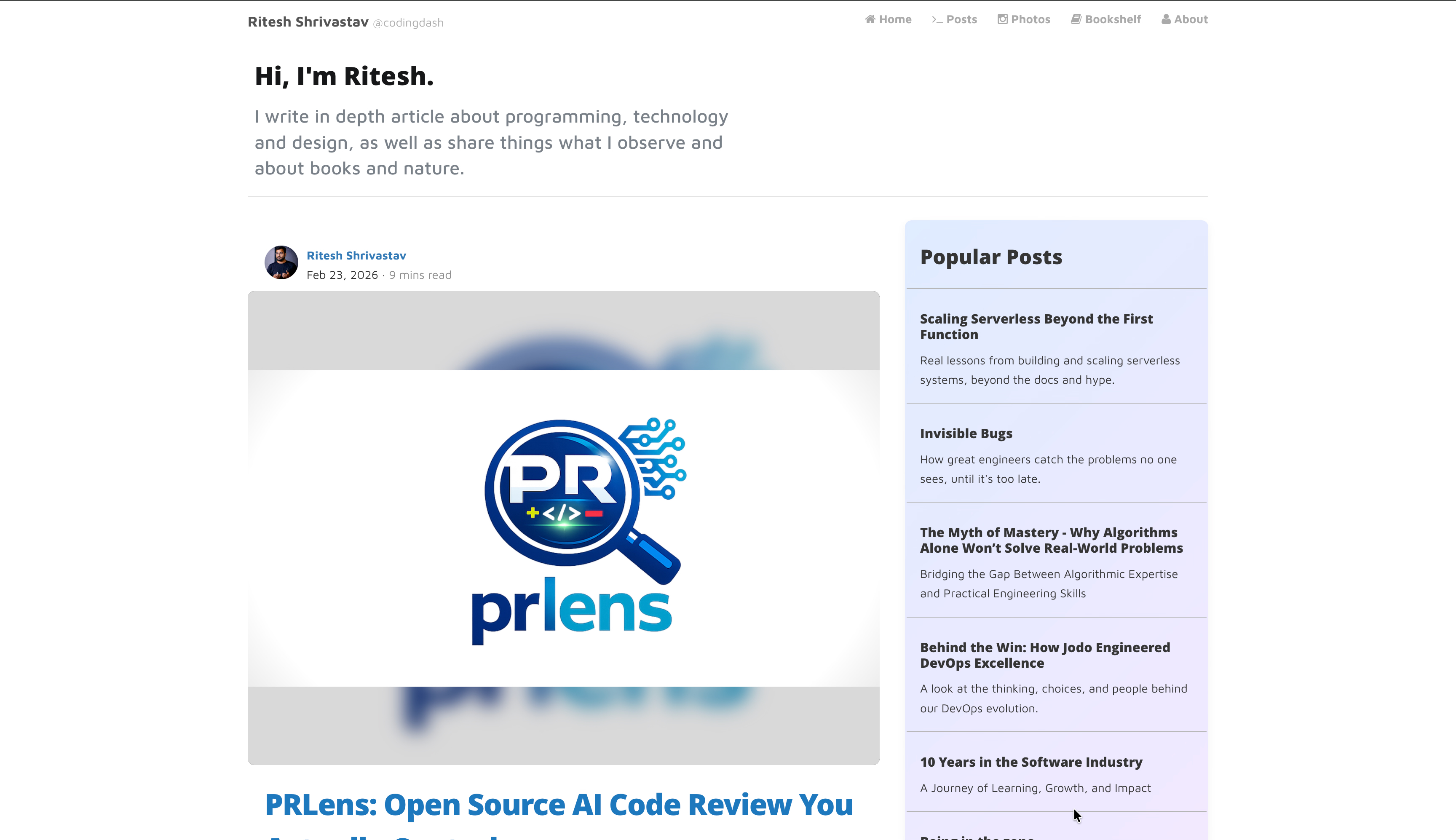
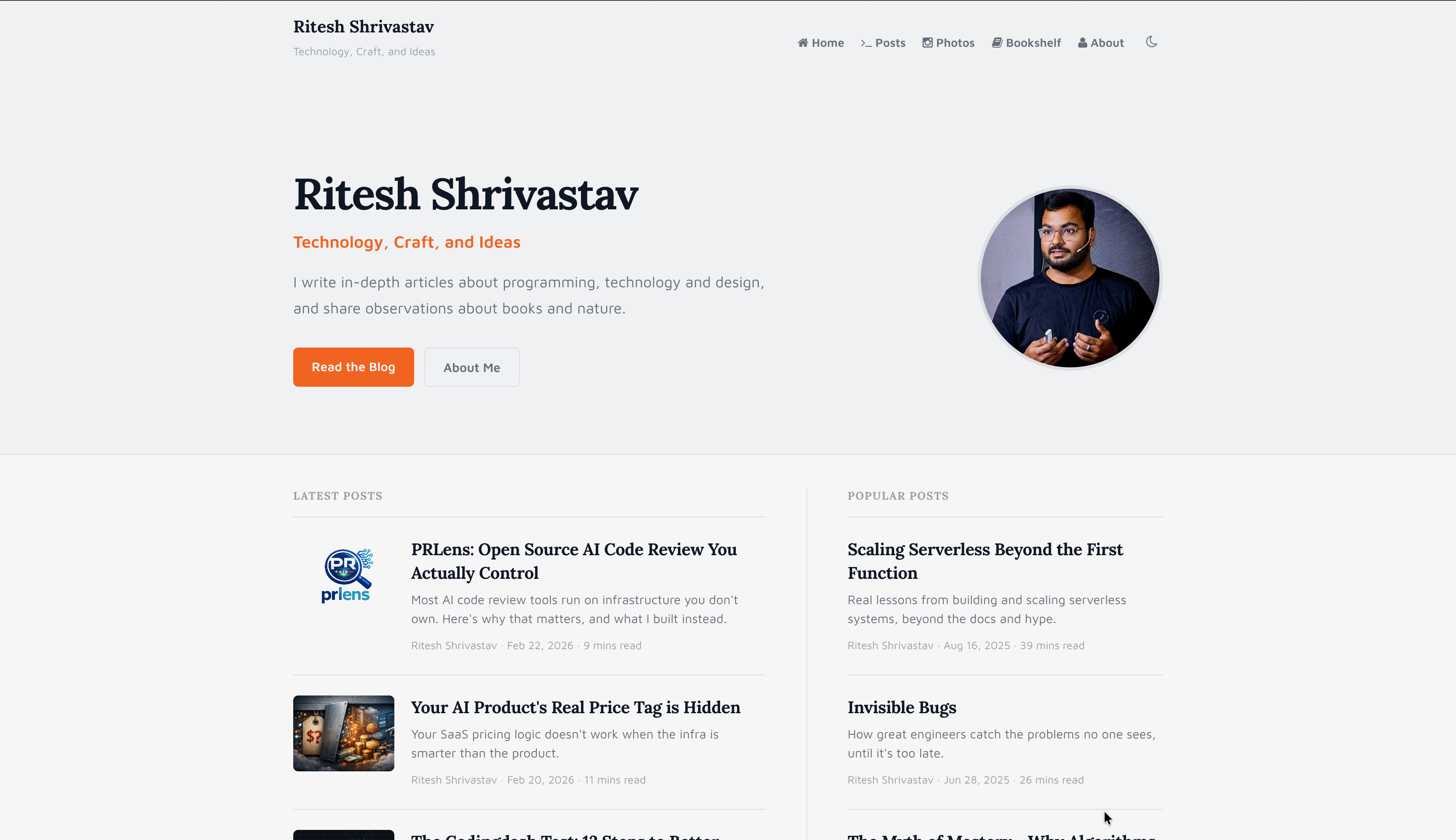
The homepage now has a proper hero — name, photo, a one-line description, and two buttons. Before it was just a paragraph and then posts. The post sections are now two columns: Latest and Popular, side by side.
Posts listing
The old layout showed each post with a large image above the title, which looked fine for posts with well-composed cover images and awkward for everything else. The new layout is a compact horizontal row — thumbnail, title, excerpt, metadata. Cleaner, faster to scan.
Reading experience
Post body text is now serif. This was a deliberate choice — long-form reading is more comfortable in a serif. The subtitle is now styled as a deck, separated from the body, the way a magazine would present it.
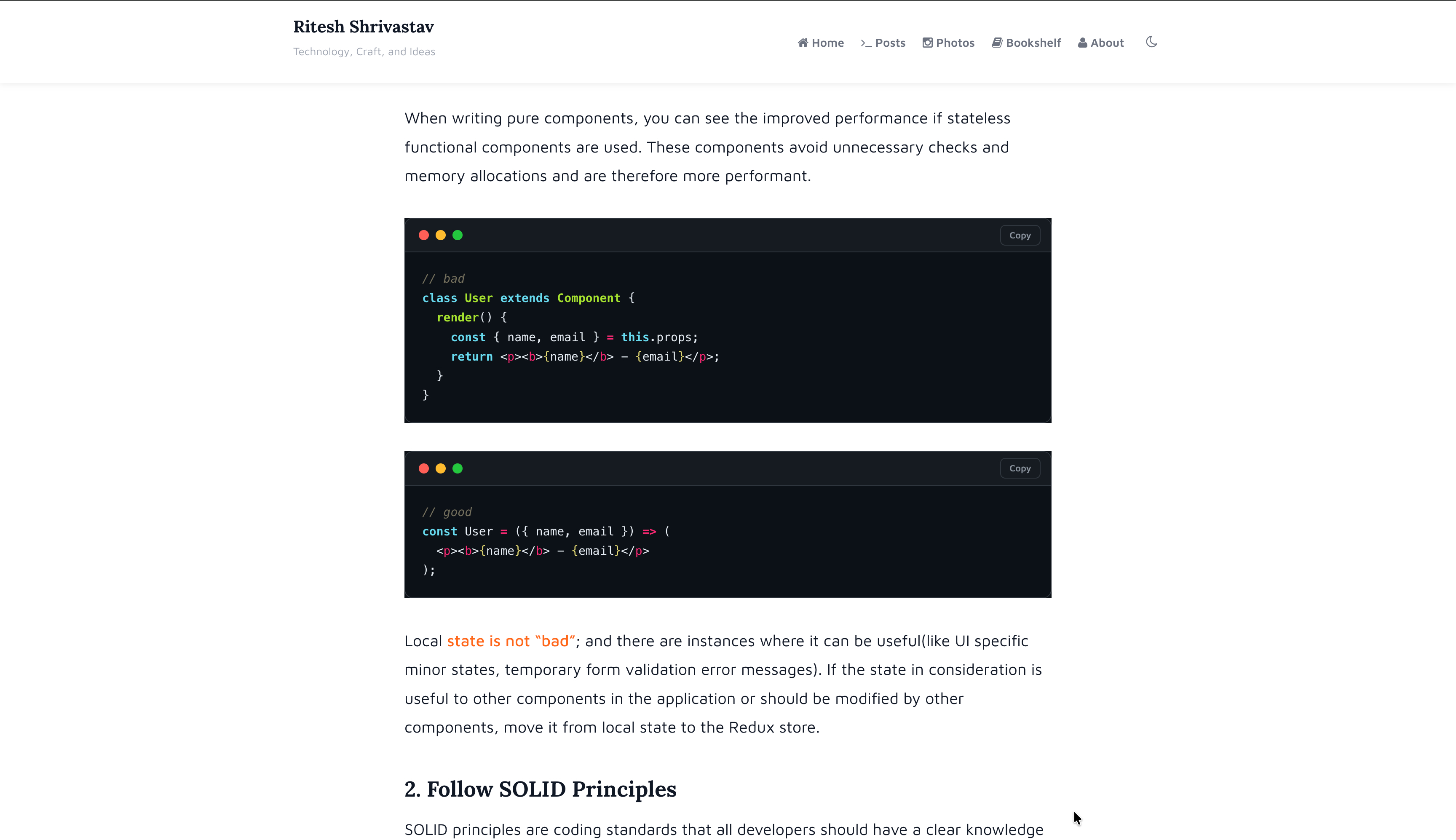
Code blocks
Traffic light dots. A copy button. A slightly darker, cleaner background. Small things, but this blog has a lot of code in it, and small things compound.
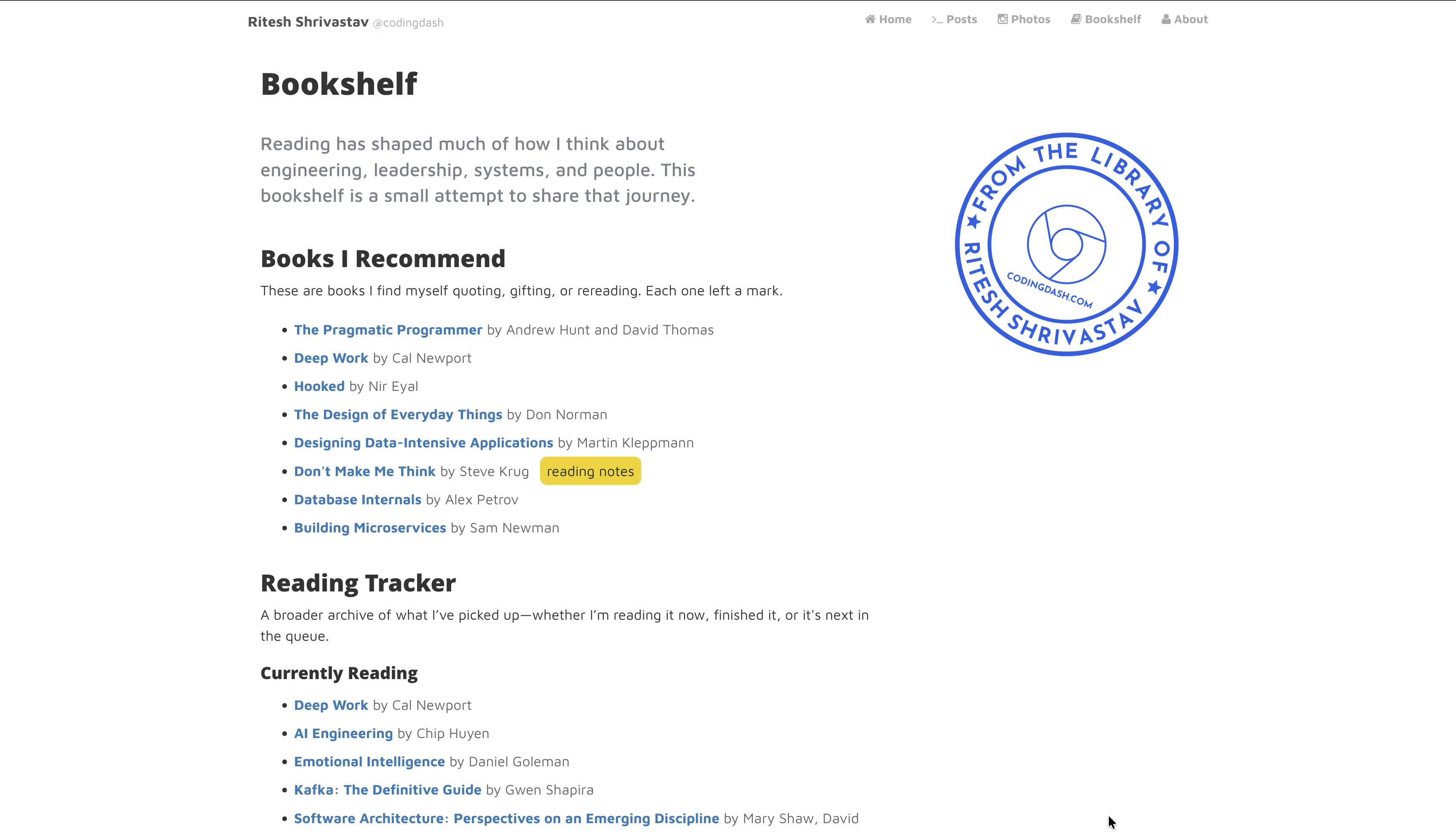
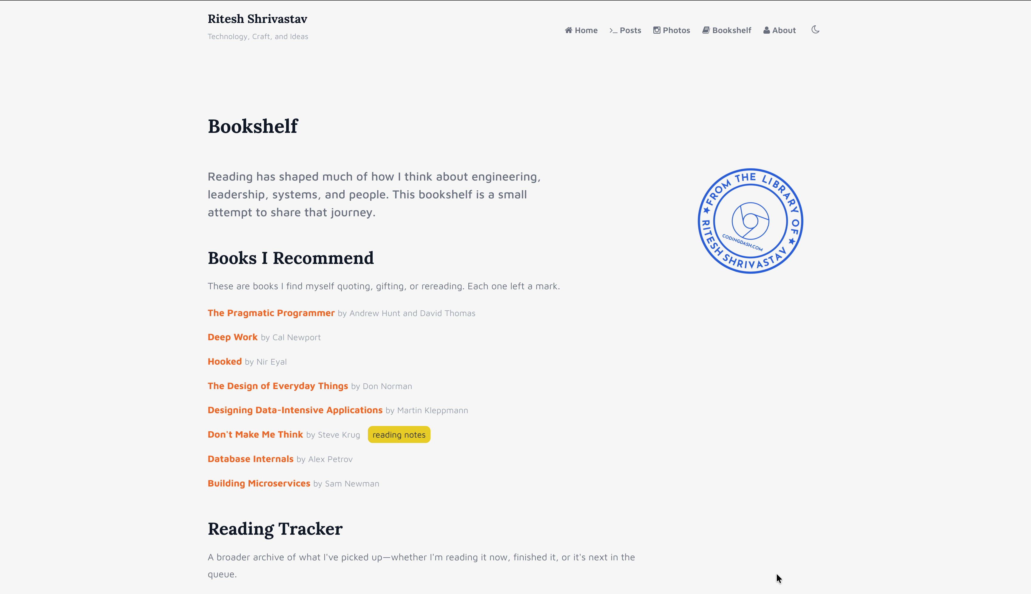
Bookshelf
The Bookshelf page is not new in content — I’ve kept a reading list for a while — but it’s been properly designed now, with a recommendations section, a reading tracker, and a library stamp that I’m unreasonably pleased with.
About page
The About page now has a proper work timeline — a chronological record of the roles and companies I’ve been part of, with brief descriptions and photos. It was always a gap on the old site. A blog that’s been running for over a decade should probably say more about who’s writing it.
Dark mode
Brand new. Toggle it with the moon icon in the nav. It was the most requested thing I got via DMs and honestly, I should have done it sooner.
What didn’t change
The writing. The topics. The fact that posts come out when they’re ready and not before. The RSS feed still works. The URLs are the same, I’ve always been careful about that. If you linked to something here, it still resolves.
The tech stack is the same too: Jekyll, GitLab Pages, Cloudinary for images. I considered a migration more than once over the years. Each time I concluded that the stack isn’t the constraint — the time to write is.
I’d been accumulating a list of friction points, small things that made the site feel dated, things I’d notice when I published a post and saw it live. The list got long enough that it made sense to address it all at once rather than piecemeal.
I also wanted the site to reflect where my work is now. The old design was built for a different stage of things. This one fits better.
If something looks broken, or if you’re reading this in an RSS reader and things look strange, let me know on X. Otherwise, there’s a lot more writing to get back to.